

Inside a JHD Home: A Cozy Modern Refresh for an Empty Nester Family
The brief for this project was one I find particularly interesting: a couple whose kids had recently left home, looking at a house that had been organized around a different version of their life for twenty years. The rooms that made sense for a family of four didn't make sense anymore. The kitchen had been designed for volume and speed, not for the quieter way they cook now. The primary suite had never really been designed at all, it had just accumulated.
They didn't want to move. They wanted to stay in the home they'd built their family in and make it feel like it belonged to this next chapter. That's a specific design problem, and it's one I think about differently than a new build or a blank-slate renovation.The Design Vision: Modern Meets Timeless
The homeowners, preparing to be empty nesters, wanted to elevate their home’s aesthetic while preserving its familiarity and emotional comfort. Jamie House Design’s goal? To create a space that felt fresh and current, yet timeless; a place where every room flowed effortlessly into the next.
Through the lens of high-end interior design, I focused on:
Clean, cohesive architectural detailing
A gut renovation of the kitchen and bathrooms
Subtle transitions that connect each space with warmth and clarity
The result is a home that feels both grounded and elevated, inviting, practical, and beautifully personal.
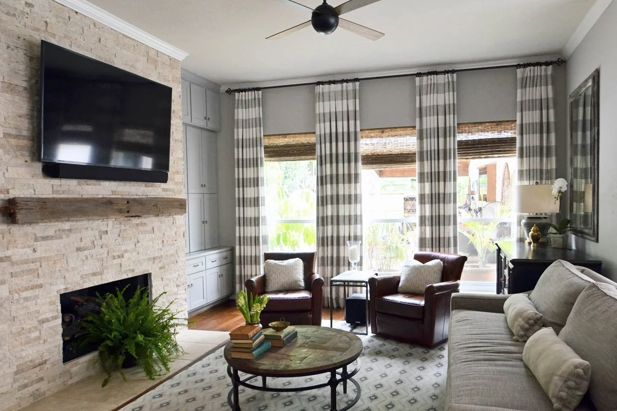
The through-line: making everything feel connected
The first thing I noticed in this house was that the rooms didn't relate to each other. The molding profiles changed from room to room. The trim heights shifted. The transitions felt arbitrary. None of it was wrong exactly; it had just been updated piecemeal over the years, each decision made in isolation from the others.
Before touching a single finish, I worked through the architectural detailing throughout the house; streamlining the moldings, unifying the trim language, creating visual continuity between spaces that had been communicating in different dialects. It's the kind of work that doesn't show up clearly in photos but is immediately felt when you walk through a finished home. The rooms stop feeling like a series of separate decisions and start feeling like a house that was designed on purpose.
AFTER

BEFORE
AFTER
BEFORE
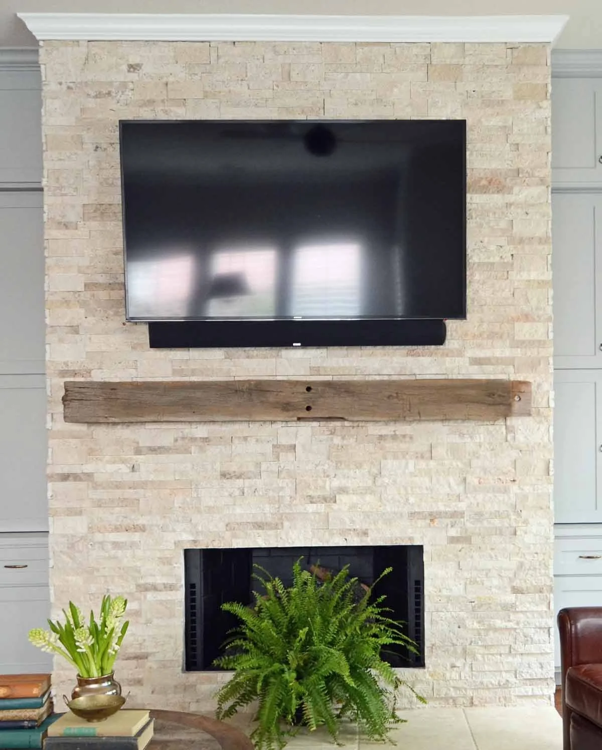
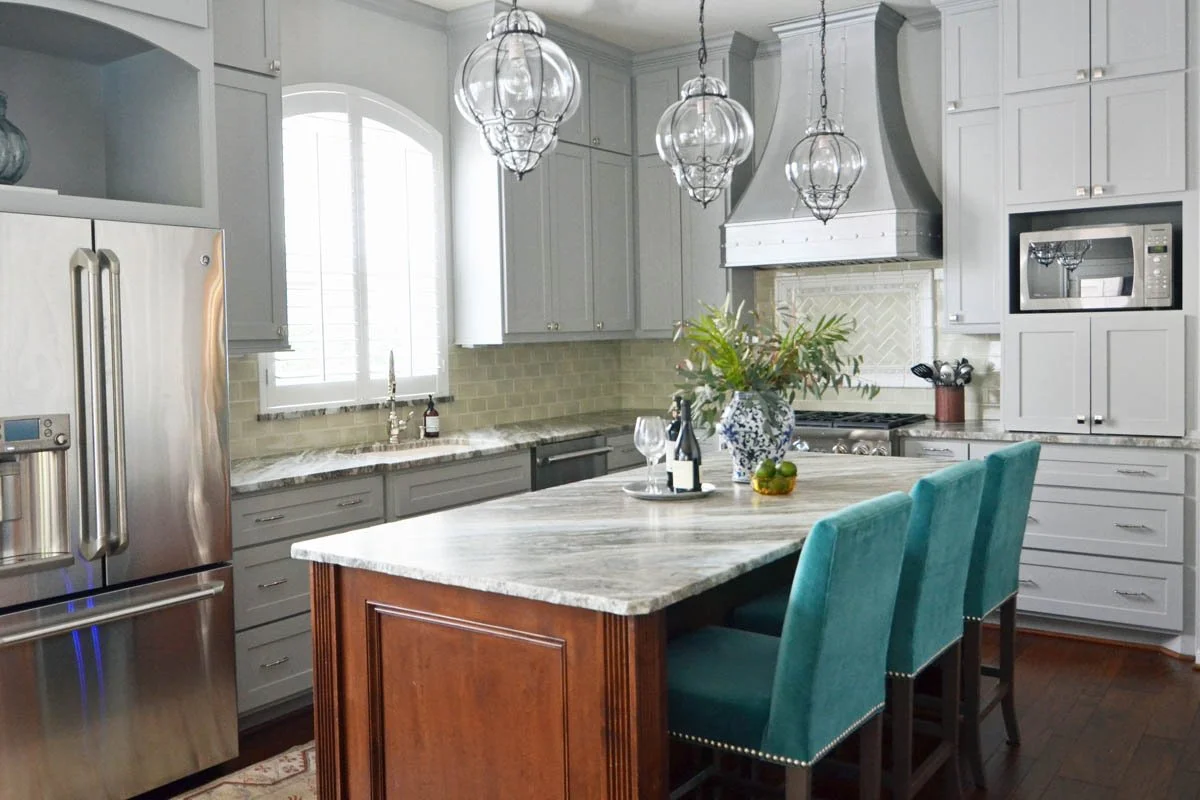
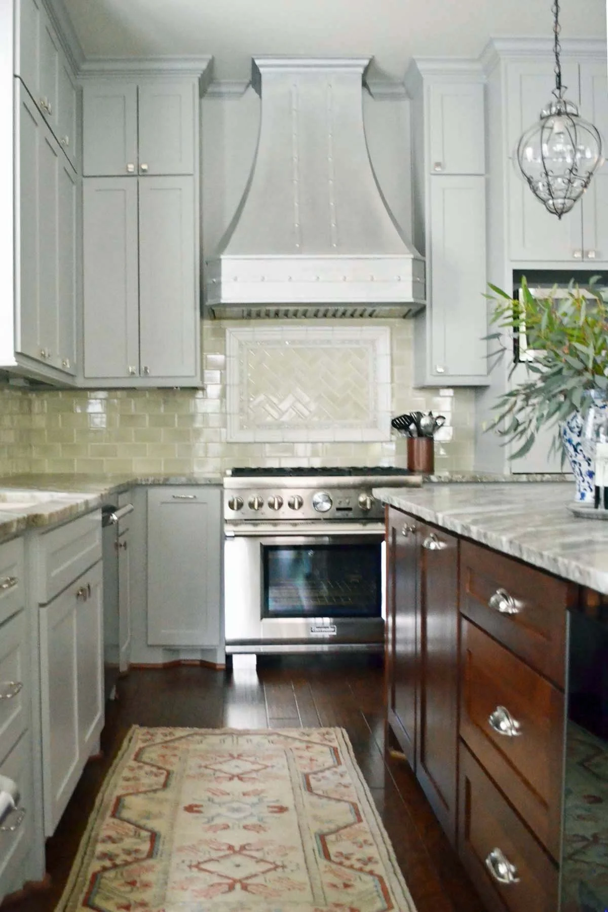
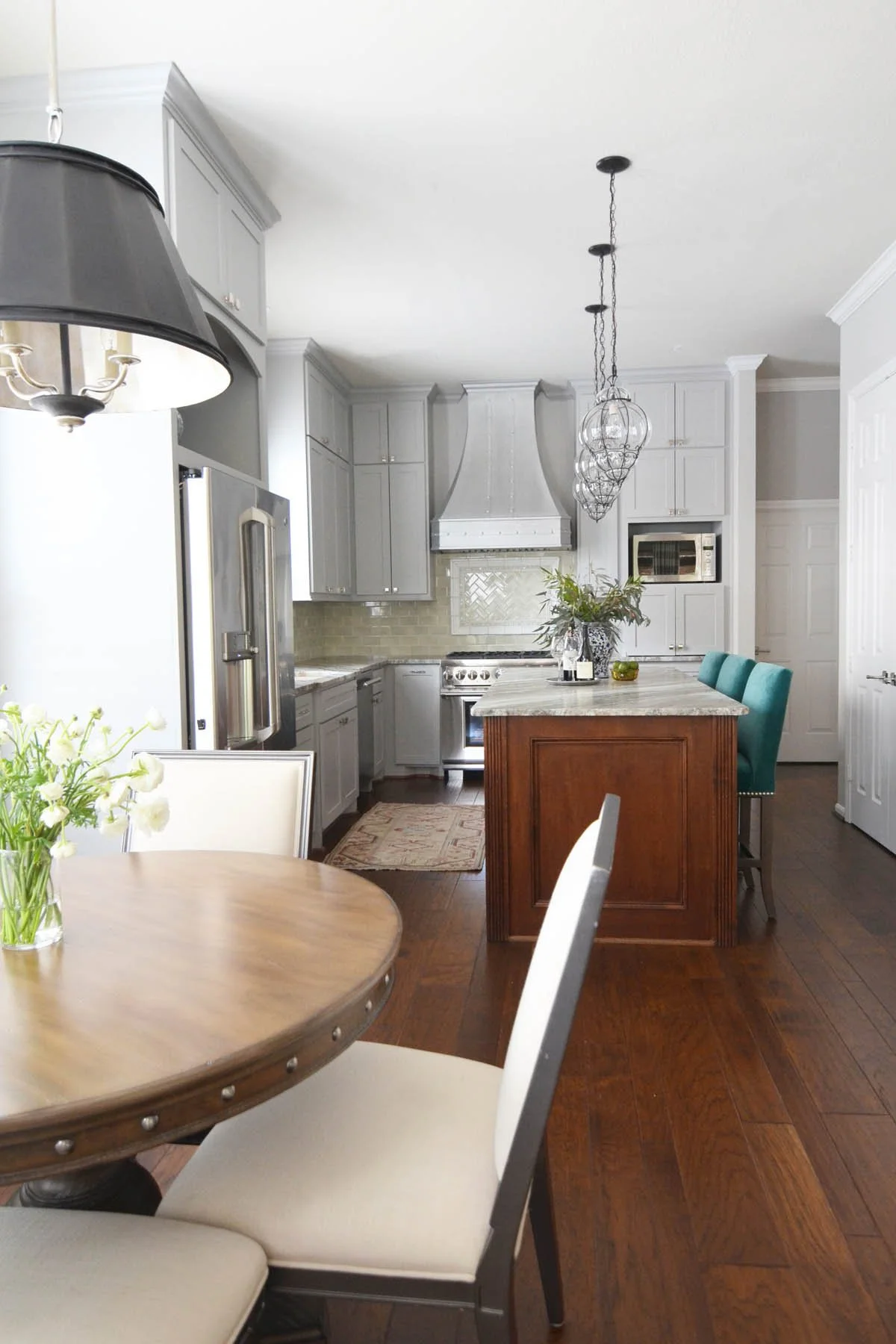
The kitchen: designed for how they use their kitchen
The original kitchen was built for a busy family; storage for everything, counter space for multiple people working at once, the kind of layout that handles homework and dinner simultaneously. It worked for that phase. It wasn't working for this one.
The gut renovation started with the layout question: how do two people cook together, and what does this kitchen need to do on a Tuesday night versus when they're hosting? The answers were different from what the original kitchen assumed. Less volume storage, better organization of what they actually use, more considered counter space rather than maximum counter space.
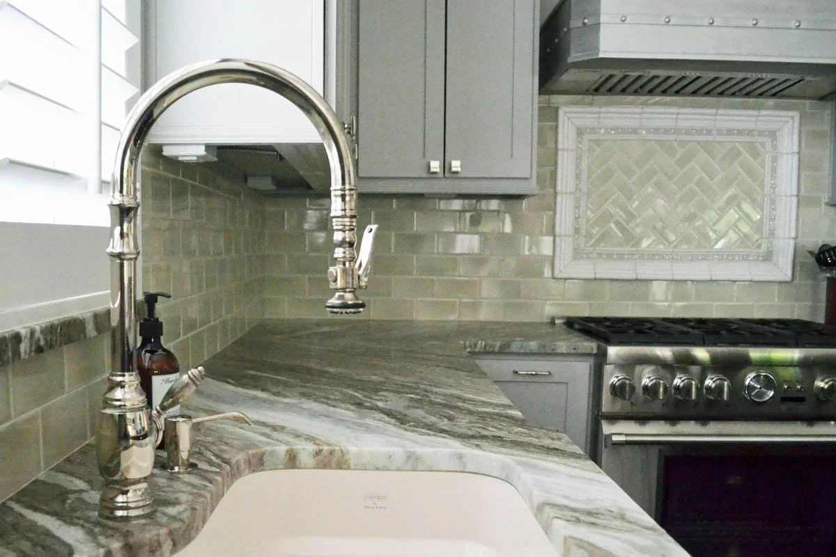
The cabinetry went from heavy and dark to clean-lined millwork in warm neutral tones. The island became a proper gathering point rather than a workspace with seating as an afterthought. Stone countertops and a thoughtful backsplash brought in material depth without competing with the view of the adjacent living room, which the renovated layout now connects to properly.
The detail I'm most pleased with: the sink placement, which moved to give a sightline into the living room. Small adjustment, completely changes how the kitchen feels to be in.
AFTER
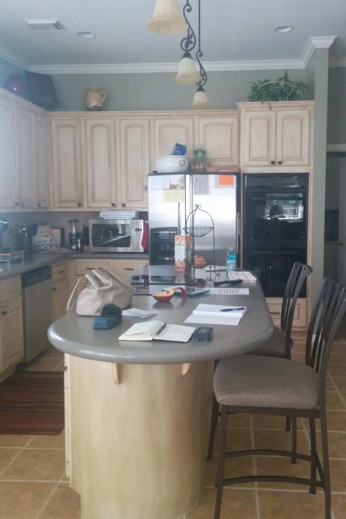
BEFORE
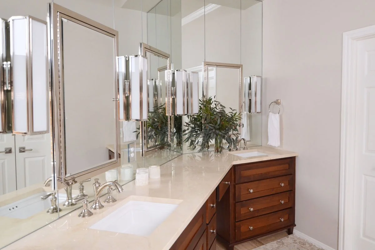
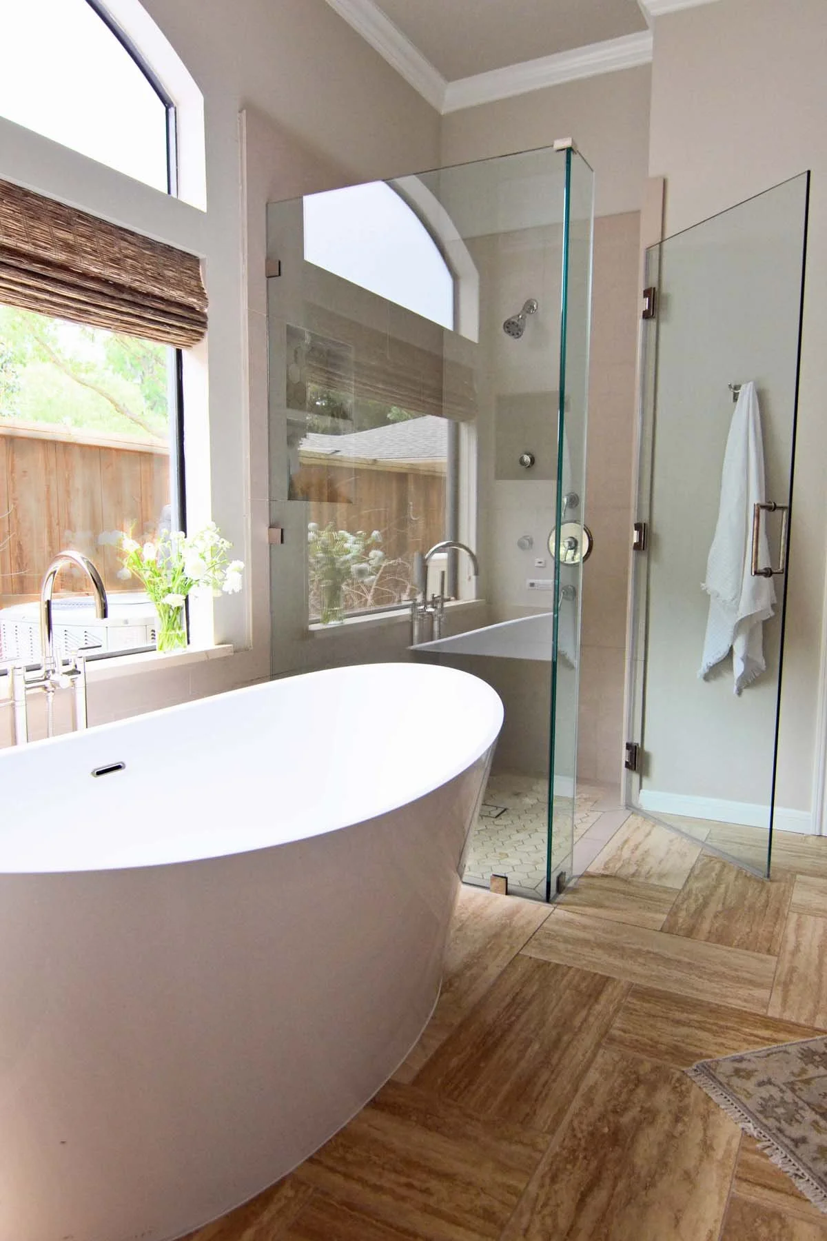
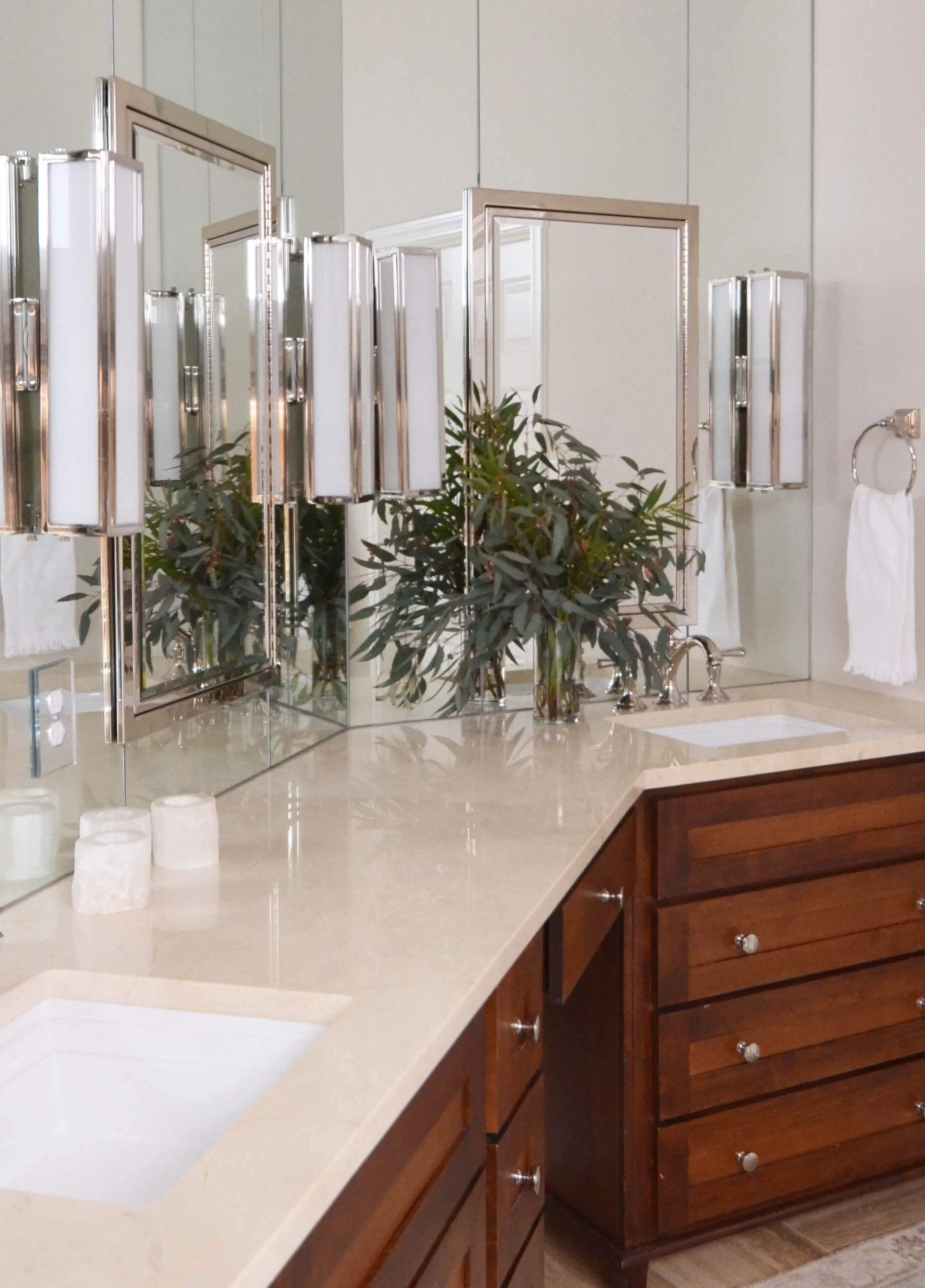
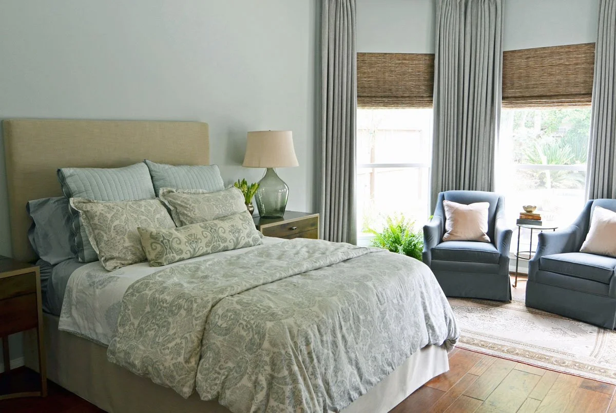
The primary suite: finally designed for two adults
The primary bathroom before this project was functional and that's the best thing that could be said about it. Twenty years of a busy household, and no one had properly renovated it.
The scope here was full: reconfigured layout, a freestanding tub positioned to become the visual anchor of the room, a walk-in shower that actually functions well for daily use, double vanity with storage designed around how two people use the space in the morning rather than how bathrooms generically get specified.
The material palette, warm stone, polished nickel fixtures, understated tile, was chosen to feel calm without feeling cold. This is a room people are in at the start and end of every day, and it should feel like a retreat rather than a holdover from the previous owners.
The powder bath and secondary bathrooms were updated to carry the same material and tonal language; nothing dramatic, just cohesive. The house reads as a whole now rather than as a series of decisions made at different times.
AFTER
AFTER

BEFORE

BEFORE
Storage as design
One of the specific challenges of designing for empty nesters is that the storage needs change completely. A family of four accumulates differently than two adults. The spaces that held sports equipment, school supplies, and the infrastructure of raising children now need to do something else — or be freed up entirely.
Every storage decision in this project was made intentionally: built-ins sized for what they'll actually hold, drawer configurations designed for how these specific people organize, closet systems that reflect a wardrobe rather than a collection of things that never quite got put away properly.
The result is a house where everything has a place; not because it was decluttered, but because the storage was designed to match the life being lived in it.


This project is in the portfolio as Empty Nesting; a whole-home renovation for a couple who wanted to stay in the home they loved and make it feel like it had always been meant for them.
If you're in a similar moment; a house that's served one version of your life and needs to serve a different one, I'd love to hear about it.
If this was useful, these might be too: