

Mixing Metals in Your Home: Why Matching Everything Is the Wrong Goal
At some point, someone told homeowners that all the metals in a room need to match. I'm not sure where this rule came from; design magazines, home improvement shows, showroom salespeople protecting their inventory, but it's one of the most reliable ways to make a home feel like it was assembled rather than lived in.
The rooms that feel most considered are almost never the ones where everything matches. They're the ones where metals were chosen deliberately and in relationship to each other, where the contrast is the point, not the problem.
Here's how I think about metal in a room.
Why matching reads as assembled
When every metal finish in a space is identical; all brushed nickel, all polished chrome, all matte black, the room signals that someone made a single decision and applied it everywhere. It's efficient. It's also visually flat.
The instinct behind matching is understandable. It feels safe. It feels coordinated. But coordination and composition are different things. Coordination means everything agrees. Composition means things are in relationship; some leading, some supporting, some providing contrast. A room with all matching metals has coordination. It lacks composition.
The rooms that feel expensive and considered, regardless of what was actually spent, almost always have some tension in them. Materials that are related but not identical. A finish that provides contrast against the dominant palette. Something that makes you look twice.
The framework that works
The approach I use on every project: one dominant metal, one secondary metal, one accent.
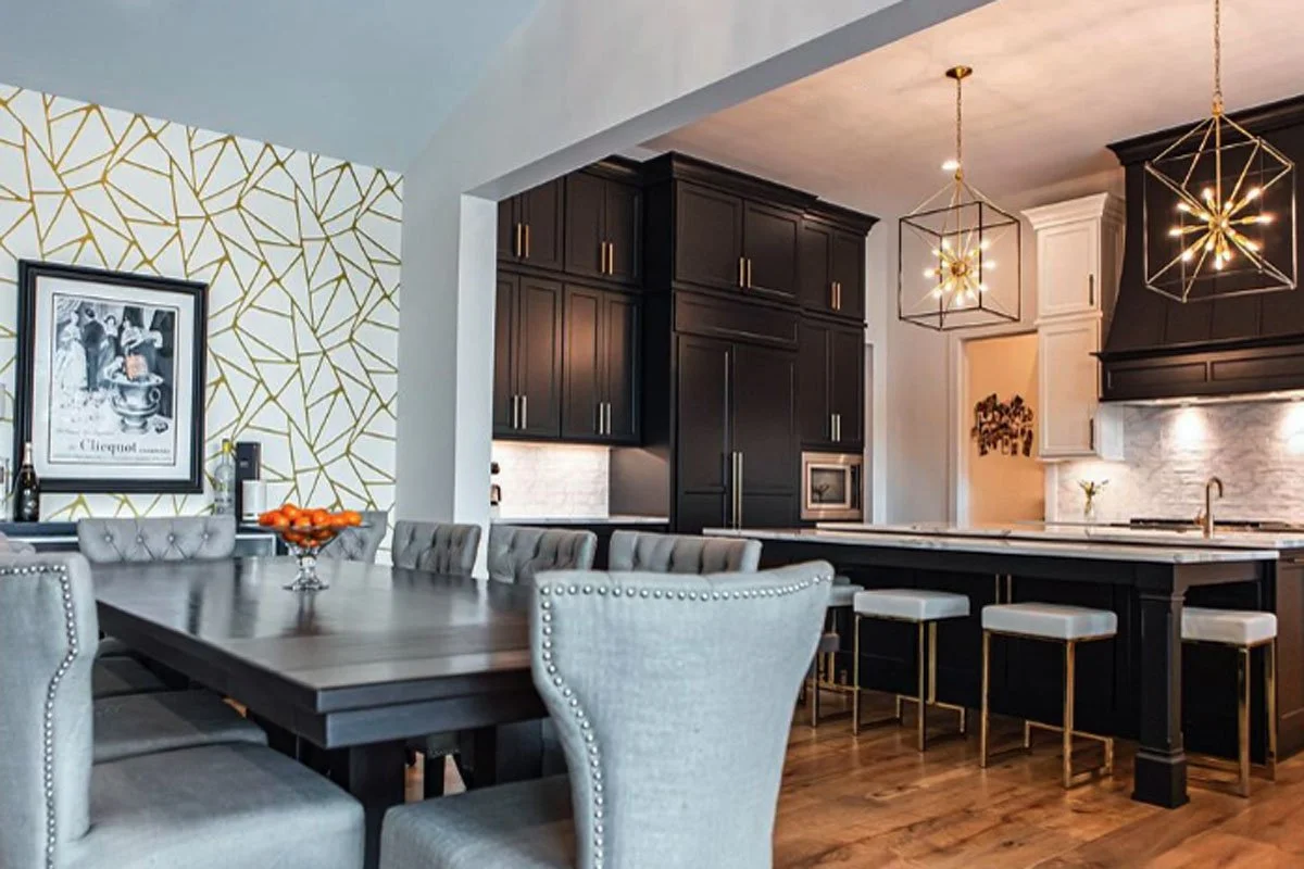
The dominant metal carries the most visual weight and appears most frequently. In Highlands Ranch and Centennial homes, this is often unlacquered brass, aged brass, or warm bronze, metals that work well with Colorado's warm light and natural material palettes. Sometimes it's matte black if the project is running cleaner and more contemporary.
The secondary metal appears less frequently and usually serves a more functional role. If brass is dominant in the lighting and hardware, the secondary might be brushed nickel in the plumbing fixtures, or a slightly different brass finish in the cabinet pulls.
The accent metal appears sparingly; a single fixture, a specific detail, a piece of furniture with metal legs. This is where contrast lives. In a room with warm brass as the dominant, a single matte black fixture provides the contrast that makes the brass read as intentional rather than default.
None of these need to be from the same manufacturer, the same product line, or even the same era.
The specific combinations that work
Unlacquered brass and polished nickel. This is one of my most-used combinations and one of the most underappreciated. Unlacquered brass is warm and develops patina over time, it ages into a room rather than staying static. Polished nickel is cooler, brighter, and more reflective. Together they create contrast without conflict, warmth without heaviness. It's the combination that reads as collected rather than coordinated, and it works across traditional, transitional, and contemporary spaces equally.
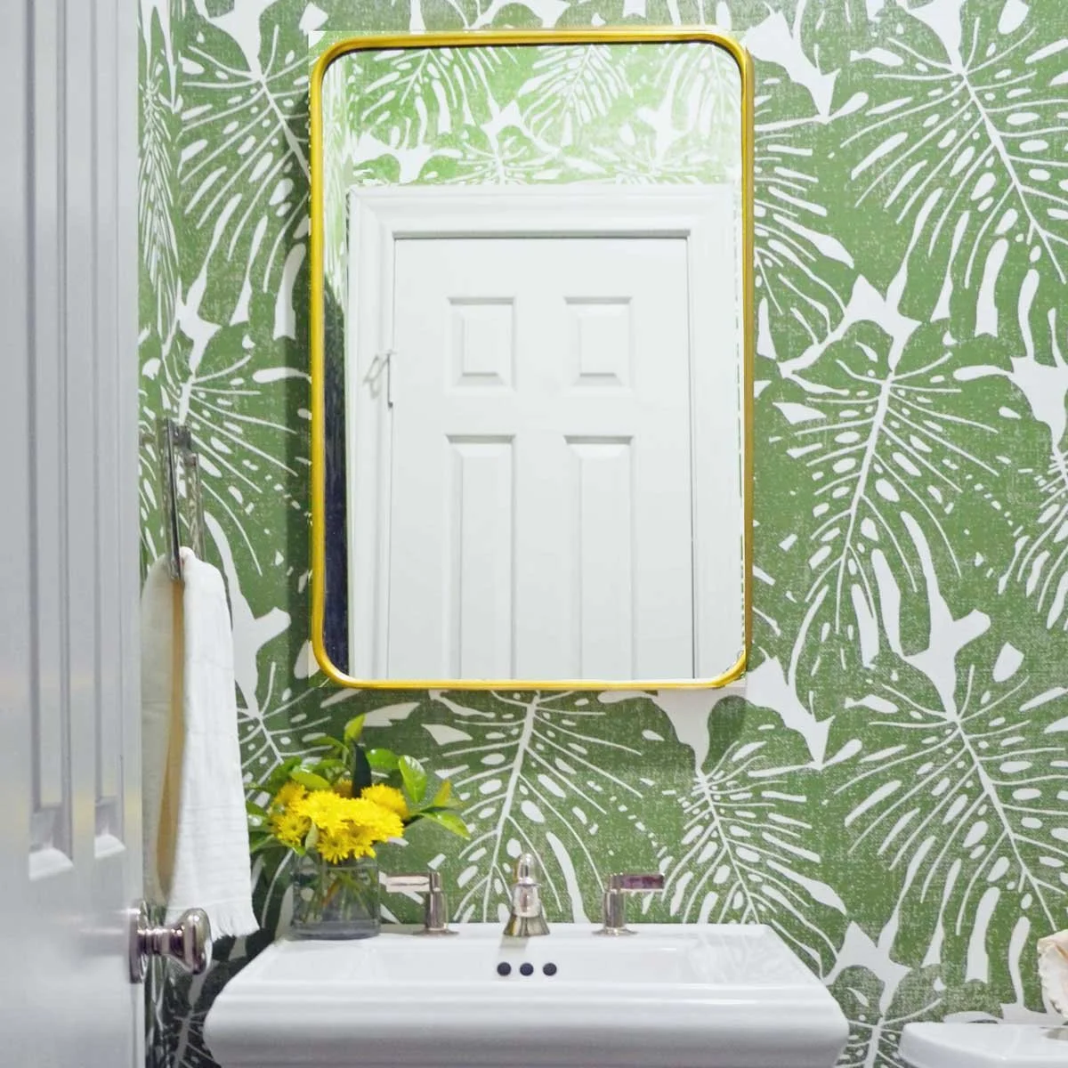
Polished nickel and black. Where unlacquered brass and nickel is warm and layered, nickel and black is crisper and more graphic. The cool brightness of polished nickel against matte black has real presence. This combination works well in lighting specifically; a black pendant or chandelier against polished nickel sconces or hardware creates the kind of visual tension that makes a room feel considered. In Colorado homes especially, I prefer to use black in lighting rather than plumbing for a practical reason I'll get to below.
Bronze and unlacquered brass. Both warm, but very different in character; bronze is darker, more muted, and slightly green-toned, while unlacquered brass is brighter and more golden. Together they feel genuinely layered, as though the pieces came from different places and different times. This is the combination I reach for when I want a room to feel collected over decades rather than purchased in a single shopping trip. It works particularly well in rooms with natural stone and wood, where you want the metals to feel like they belong to the same material world.
Brushed nickel and copper. A less common combination but a rewarding one. Copper is warm and saturated in a way that unlacquered brass isn't, more insistent, more present. Brushed nickel is cooler and more matte than polished nickel. Together they have an almost artisanal quality, particularly in bathrooms and kitchens where both can appear as fixtures and hardware simultaneously.
A note on black plumbing fixtures in Colorado
Black plumbing has become synonymous with mountain modern design, and I understand the appeal, it reads as bold and contemporary, and in the right context it photographs beautifully.
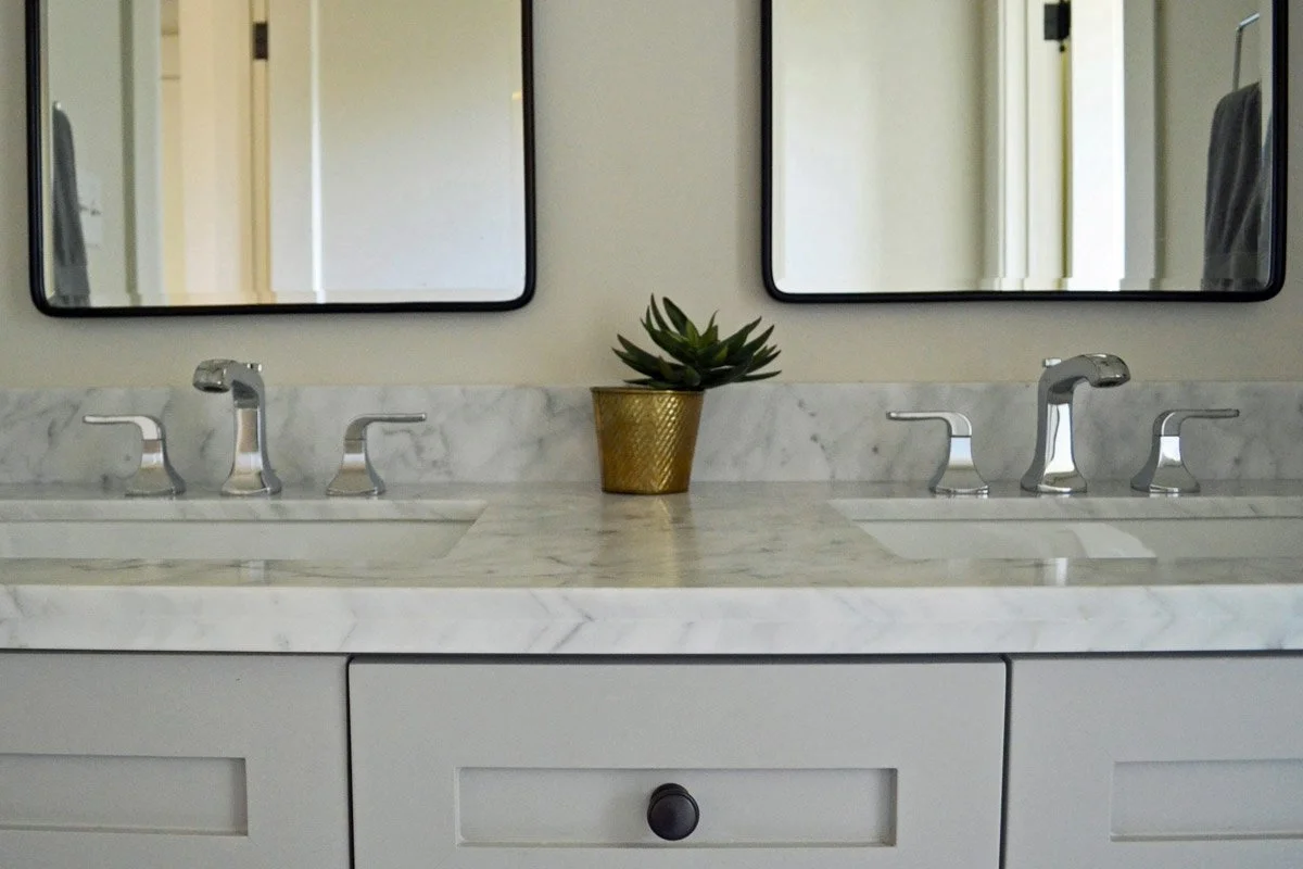
But in Colorado specifically, I steer clients away from black plumbing more often than not, and here's why: our water is exceptionally mineral-rich. Hard water deposits, calcification, and water spots are facts of life here in a way they aren't in most other parts of the country. On a polished nickel or brass fixture, those deposits wipe away or blend into the finish. On a matte black fixture, they show white against dark; constantly, visibly, and in a way that requires more maintenance than most people want to commit to.
I think of plumbing fixtures the way I think about jewelry, they're the pieces that add sparkle and depth to a room, that catch the light, that reward close looking. A beautiful polished nickel faucet or a warm brass shower fitting does that work. It has presence and reflectivity. Black plumbing tends to absorb light rather than reflect it, which makes it feel heavier and less like jewelry and more like hardware.
My approach in most Colorado projects: use black where the water doesn't touch it. A black chandelier over a dining table, black sconces flanking a mirror. Then let the plumbing be polished nickel or unlacquered brass; something that sparkles, something that holds up to the water, something that gets more beautiful as it ages rather than more difficult to maintain.
What to worry about
The metal question that matters more than matching versus mixing: warm versus cool.
Warm metals; brass, bronze, gold, copper, work with warm palettes, warm woods, natural stone with warm undertones. Cool metals, chrome, polished nickel, stainless, work with cooler palettes, gray-toned woods, marble with cool veining.
Mixing warm and cool metals in the same room is where things actually go wrong, not mixing different finishes within the same temperature family. Two different brass finishes in the same room; unlacquered and brushed, for instance, read as intentional variation. Brass and chrome in the same room read as an incomplete decision.
This is the underlying reason the "match everything" rule exists, it's a blunt instrument for avoiding the warm/cool conflict. But a better instrument is just understanding what you're working with and choosing accordingly.
The practical questions to ask before buying anything
Before purchasing any fixture, pull, or hardware, ask: what metals are already fixed in this room that I can't change? The plumbing rough-in, the existing light fixture if it's staying, the window hardware. Those are your anchors. Everything else is chosen in relationship to them.
Then: am I running warm or cool in this room overall? The floor, the cabinetry, the walls. Once that's established, the metal choices become much more constrained and the decisions become easier.
What you're not asking: does this match the other hardware exactly? That's the wrong question, and the rooms that ask it are the rooms that end up looking like a showroom floor sample rather than a home.
If you're working through a renovation in Highlands Ranch, Centennial, or Littleton and metal decisions are part of what's holding up the project, that's the kind of thing a consultation can resolve quickly; a few hours, a clear direction, and the ability to move forward without second-guessing every finish.