

Symmetry, Balance, and When Rules Are Worth Breaking
Most design rules exist for good reason. Symmetry creates calm. Balance makes a room feel resolved. Proportion tells your eye where to rest. These aren't arbitrary preferences, they're rooted in how humans perceive and respond to space.
But rules applied without judgment produce rooms that are correct and lifeless. The homes that stop you, the ones you walk into and immediately want to stay in, almost always have at least one moment where someone made a deliberate choice to break the expected pattern. Knowing which rules to follow and which ones to break, and why, is most of what separates a designed room from a decorated one.
Symmetry: Why It Works and Why It Gets Boring
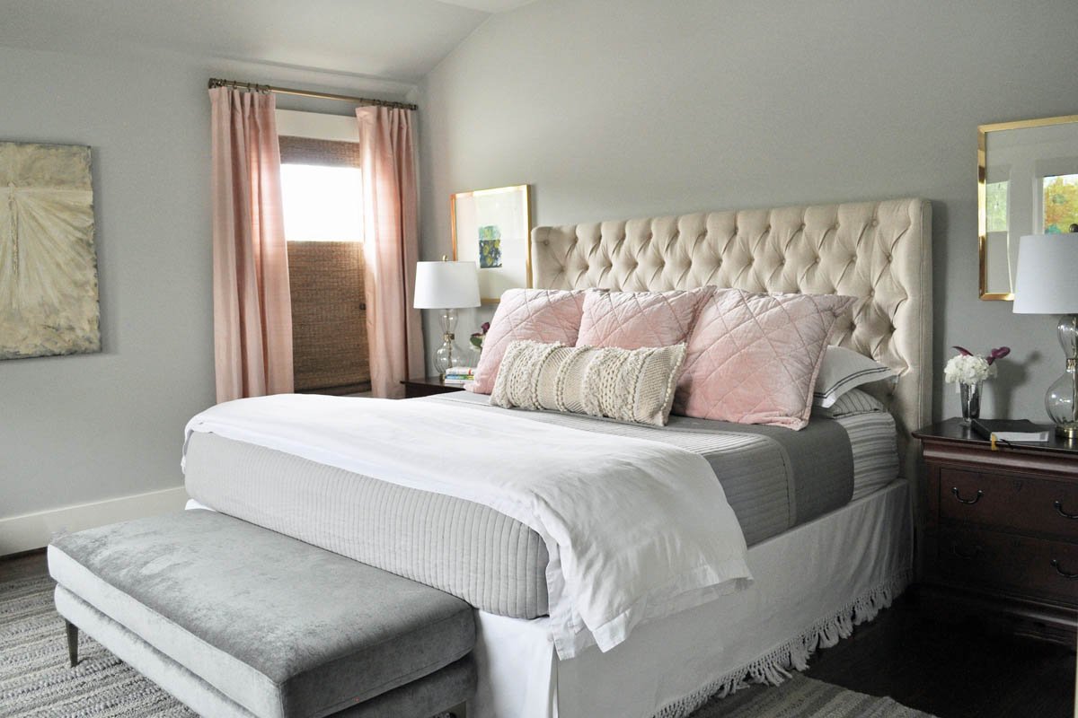
Symmetry is the easiest way to make a room feel intentional. Two matching nightstands, a sofa flanked by identical chairs, a mantel with mirrored arrangements on each side, these signal order and calm immediately. In a bedroom especially, symmetry does real psychological work. It says: everything here is considered. You can relax.
The problem is when symmetry becomes the default rather than a choice. A perfectly symmetrical living room can feel like a model home, correct in every way and belonging to no one in particular.
When to break it: The bedroom is usually the place to keep symmetry. The living room is usually the place to question it. An asymmetrical sofa arrangement, one oversized chair where a matching pair would be expected, artwork hung off-center; these moments of deliberate imbalance are what give a room personality. The key word is deliberate. Asymmetry that looks accidental reads as unresolved. Asymmetry that looks chosen reads as confident.
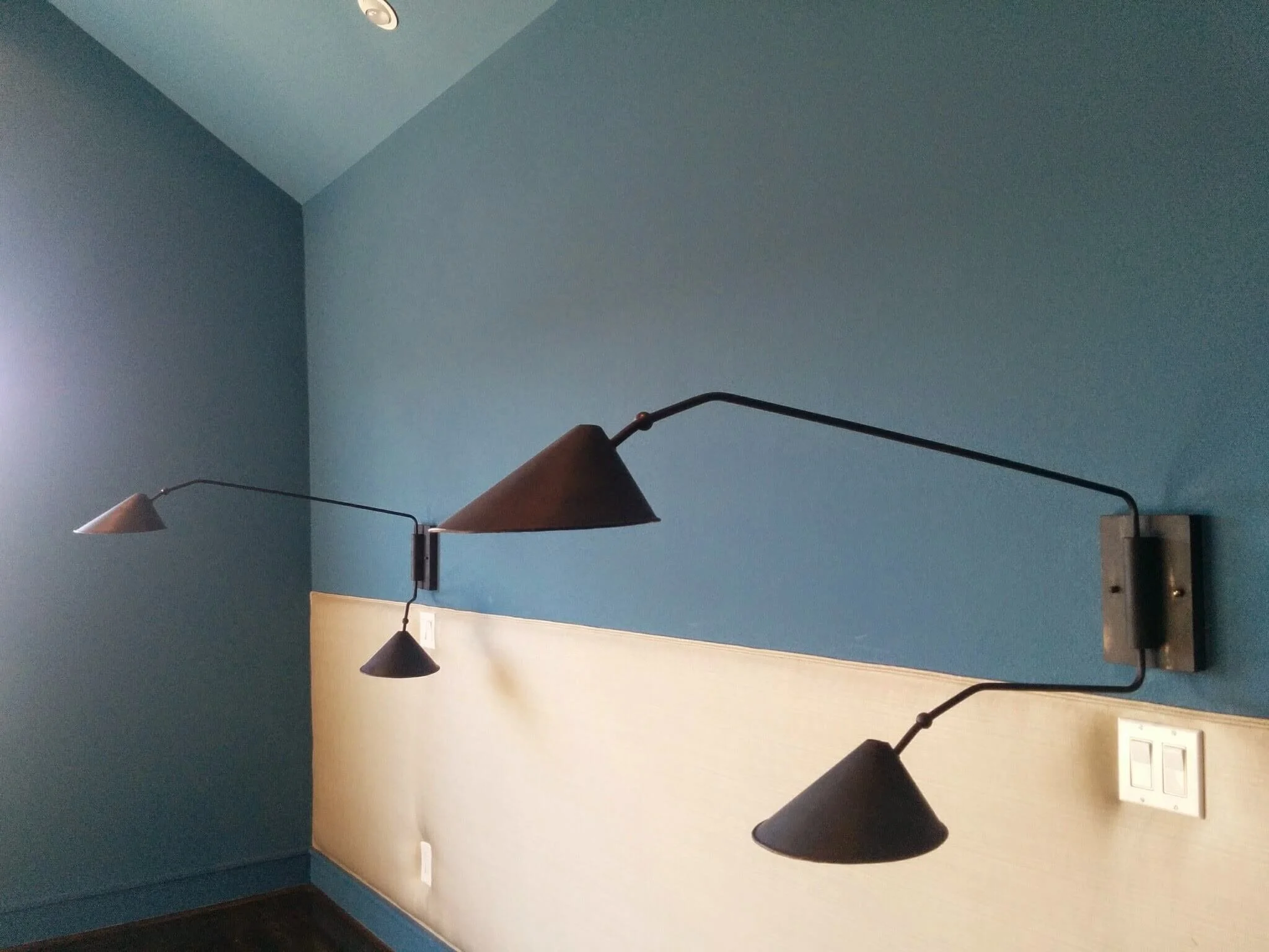
Balance: The More Interesting Principle
Balance is not the same as symmetry. A room can be perfectly balanced without a single matching pair in it.
Visual weight is what balance is actually about. A large dark sofa on one side of a room needs something on the other side with enough visual presence to hold its own, but that something doesn't need to be another sofa. A pair of lighter chairs, a substantial piece of art, a floor lamp with a bold base, an architectural feature like a built-in or a window, any of these can balance a heavy anchor piece without mirroring it.
This is where asymmetrical rooms can feel more alive than symmetrical ones. The eye moves around the room finding balance rather than simply confirming it. That movement is what makes a room feel interesting rather than static.
The practical test: Stand in the doorway and half-close your eyes. Does one side of the room feel heavier than the other? If yes, something needs more visual weight; a larger rug, a taller lamp, a piece of art. The fix doesn't need to match what's on the heavy side. It just needs to hold its own against it.
Proportion: The Rule That's Rarely Worth Breaking
If there's one rule that holds almost universally, it's proportion. The wrong-sized rug is the most common mistake in residential design; a rug too small for a seating area makes the furniture look like it's floating and the room feel unanchored. A sofa too large for a space makes the room feel smaller, not grander. A light fixture too small for a dining table looks forgotten rather than intentional.
Proportion is worth getting right before anything else because it's the mistake that makes every other decision look wrong even when those decisions are fine. A beautifully chosen rug in the wrong size undermines the whole room.
The general guideline: In a living room, the rug should be large enough that at least the front legs of every major seating piece sit on it. A dining rug should extend at least 24 inches beyond the table on all sides so chairs stay on the rug when pulled out. A pendant over a dining table should be 12 inches narrower than the table on each side.
These aren't unbreakable, but when you break them, break them intentionally and dramatically. A deliberately oversized rug reads as a choice. A slightly-too-small rug just reads as a mistake.
The One Rule Worth Breaking Most Often
Everything has to match.
It doesn't. In fact, a room where everything matches; same wood tone, same metal finish, same visual register, is a room that feels like it was purchased as a set. Sets are for hotel rooms. Homes should look like they've been lived in and thought about over time.
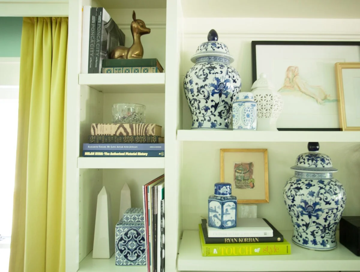
Mixing metals is one of the most common places this comes up, and one of the most misunderstood. Two or three metals in a room isn't a mistake, it's how real rooms work. The key is having one metal dominate and the others appear in smaller doses. Unlacquered brass as the primary finish, matte black as an accent, a bit of warm bronze in an antique piece, this is a room that looks collected. Perfectly matched brushed nickel throughout is a room that looks specified.
The same principle applies to wood tones, fabric textures, and furniture styles. Contrast is what creates interest. The skill is knowing how much contrast is dynamic versus how much is chaotic, and that's a judgment call that comes from looking at a lot of rooms and understanding why they work.
The Underlying Principle
Every rule in design exists because it solves a problem, proportion solves the problem of rooms that feel off without anyone knowing why, symmetry solves the problem of spaces that feel unsettled, balance solves the problem of rooms that feel lopsided. Understanding what problem the rule is solving tells you when the rule still applies and when the situation calls for something different.
Break rules when you understand them well enough to know what you're trading. Keep them when the room needs what they provide. The rooms that work best are usually the ones where someone made both kinds of decisions on purpose.
If you're working through design decisions for a renovation or a room that isn't coming together, a consultation is the right place to start.
If this was useful, these might be too: