

The Jewelry of a Room: How to Choose and Place Lighting
I think about lighting the way I think about jewelry.
Not all of it is meant to be noticed. A well-cut suit doesn't need a statement necklace, but the right one makes the look, shows a certain perspective. The same logic applies to a room. Most of the lighting in a well-designed home should disappear. Recessed cans flush to the ceiling, doing their job without calling attention to themselves. A ceiling fan that blends into the architecture rather than dominating it. Undercabinet LEDs that illuminate a countertop without announcing their presence.
All of that quiet infrastructure exists so that when something extraordinary shows up, an antique chandelier, a cluster of unexpected pendants, a sculptural sconce that stops you in the doorway, it lands in an impressive way.
That contrast is intentional. It's the point.
The utilitarian layer should disappear
This is the part most people get backwards. They spend significant money on recessed lighting, ceiling fans, and flush-mounts, fixtures that are inherently utilitarian, and then skimp on the decorative pieces that should actually be doing the visual work.
My approach is the opposite. Recessed cans should be as small and unobtrusive as possible, trimmed in white or ceiling color, placed to do their functional job without drawing the eye. Ceiling fans, when they're necessary, should be simple, blade-heavy, low-profile, the kind that read as architectural rather than decorative. Flush-mounts in hallways and closets should be the most boring thing in the room.
None of this is where your money or your attention should go.
The goal is a ceiling that recede, a neutral backdrop against which something genuinely beautiful can exist.
The statement fixture is the thing you remember
Think about the rooms you've walked into and remembered. I'd wager that in most of them, the lighting had something to do with it.
Not the recessed cans. The chandelier over the dining table that was clearly sourced from somewhere specific, not ordered from a big-box catalog. The pair of sconces flanking a bathroom mirror that looked like they'd been pulled from a Paris apartment. The cluster of pendants over a kitchen island that shouldn't have worked together and somehow did.
Statement lighting has a quality that's hard to articulate but easy to recognize: it looks like a decision was made. Not "what fits the opening" but "what's interesting here."
That's the question I'm always asking when I'm sourcing lighting for a project. Not what's appropriate. What's interesting.
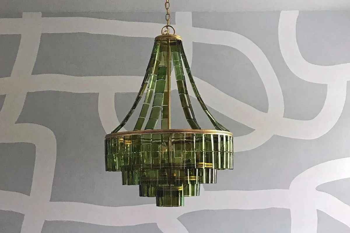
Why I love antique lighting
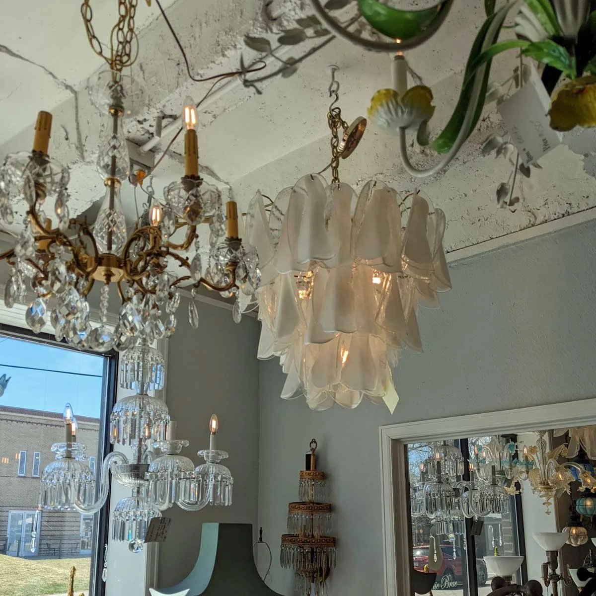
Antique and vintage fixtures carry something new ones almost never do: a material history. Aged brass that developed its patina over decades rather than being chemically induced to look that way. Glass shades with small imperfections that catch light differently than machine-perfect production pieces. Proportions that were designed before everything became standardized.
I've sourced antique fixtures in Berlin flea markets, Houston antique districts, online dealers, and estate sales, and I'll spend real time hunting for the right piece because it changes a room in a way that a $400 chandelier from a lighting showroom simply doesn't.
There's also a sustainability argument, though that's not my primary motivation: a fixture that was built in 1940 and is still functioning beautifully is doing something no new piece has had the chance to do yet.
Antique lighting isn't always the answer; some spaces call for something contemporary and sharp. But in a room that's meant to feel collected and specific rather than assembled, a vintage fixture is often the fastest way to get there.
Placement matters as much as the fixture itself
The most common mistake I see isn't choosing the wrong fixture, it's placing the right one incorrectly.
Height: Chandeliers over dining tables should hang lower than most people's instinct tells them. The standard advice is 30–36 inches above the tabletop, but I often go lower, especially with a fixture that has real presence. You want it in the room with you, not floating near the ceiling as a distant object.
Scale: Err larger. Almost every time. A fixture that feels slightly oversized in an empty room will feel exactly right once the furniture, textiles, and art are in. The fixture that seemed perfectly proportioned in the showroom often disappears once the room is furnished.
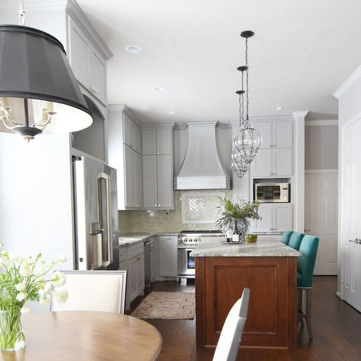
Groupings over single fixtures: A cluster of three or five pendants at varying heights almost always reads as more interesting than one larger pendant doing all the work. The asymmetry and variation creates something that feels curated rather than installed.
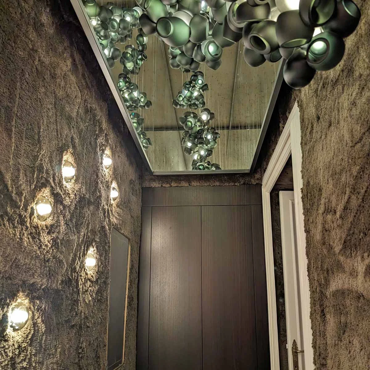
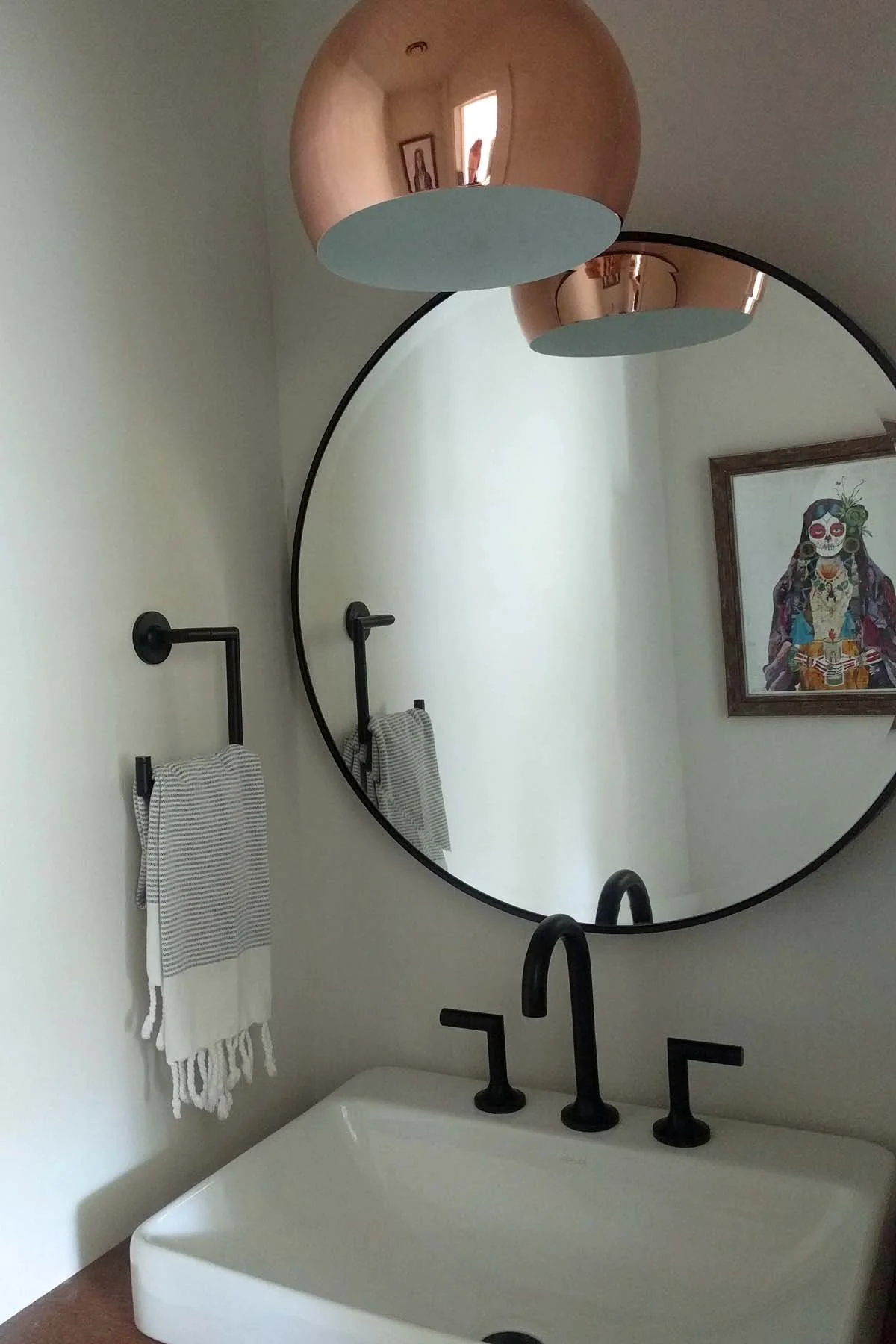
Unexpected locations: Sconces don't only belong flanking mirrors and bed headboards. A single sconce at the end of a hallway, at the correct height and with the right scale, can make a transitional space feel considered rather than forgotten. A picture light on a significant piece of art is one of the most underused moves in residential design.
The sconce as an art object
Of all the lighting categories, sconces are the ones I find myself most drawn to, and the ones most often treated as an afterthought.
A great sconce is sculptural. It exists on the wall as an object, contributing to the room even when it's off. The best ones have presence in the same way a good piece of art does: you'd notice if they were gone.
I look for sconces with interesting arms, unusual materials, handmade glass shades, aged metal, or proportions that feel specific rather than generic. Vintage and antique sconces are particularly good for this; the craftsmanship in older pieces often has a quality and detail that's expensive or impossible to replicate in production today.
A note on mixing metals and eras
You don't have to commit to a single metal or a single era of lighting. In fact, rooms that mix them intelligently often feel more interesting than rooms where everything matches.
The rule I use: pick one dominant metal and let the others appear as accents. Aged brass might carry the chandelier and the sconces; unlacquered brass appears in the hardware; a single black fixture in the kitchen provides contrast. None of it needs to be the same brand or the same finish; it needs to feel intentional, which is different from identical.
The same logic applies to eras. A room can hold an antique chandelier, contemporary pendants over an island, and mid-century sconces in a hallway. What makes it work is proportion, scale, and a through-line of material or tone that connects them.
Lighting is one of the last things most homeowners think about and one of the first things that tells me whether a room is finished. Not the can lights in the ceiling — those are just infrastructure. The piece that stops you. The fixture that makes someone ask where it came from.
That's the jewelry. Everything else is just the suit.
If you're in the middle of a project and the lighting still feels unresolved, that's often exactly when a conversation is most useful.
If this was useful, these might be too: