

The Ultimate Guide to Choosing Paint Colors for Colorado's Light
The first time I painted a room in Colorado after returning from Berlin, I made a critical mistake. I chose a soft gray that photographed beautifully in my inspiration images. In Colorado's intense, high-altitude sunlight flooding through south-facing windows, that "soft gray" looked lavender at noon and green by 4 PM.
Colorado's light is different. At 5,280+ feet elevation, we get 25% more UV exposure than sea level. We have 300+ days of sunshine annually. Our dry, clear air lacks the humidity that softens light in coastal regions. The result? Paint colors behave differently here than anywhere else I've worked, from Berlin to Shanghai to coastal Texas.
After designing homes across South Denver suburbs for the past several years, I've learned how to work with Colorado's dramatic light instead of fighting against it. Here's what you need to know before painting your Centennial, Castle Pines, Highlands Ranch, or Littleton home.
Understanding Colorado's Unique Light Quality
High-Altitude Intensity
At Colorado's elevation, sunlight travels through less atmosphere, arriving more intense and direct than at sea level. This intensity amplifies every undertone in paint colors.
Colors that appear neutral elsewhere often reveal hidden undertones in Colorado:
Grays shift blue, green, or purple
Beiges can look pink or yellow
Whites appear stark or icy
Warm colors intensify
Direction Matters: How Windows Face
The direction your room's windows face dramatically impacts how paint colors appear throughout the day.
North-facing rooms (coolest light):
Receive indirect, cool-toned light all day
Colors appear more muted and gray
Blues, greens, and grays can feel cold
Need warmer paint colors to compensate
South-facing rooms (warmest, most intense light):
Receive direct sunlight most of the day
Colors appear brighter and more saturated
Whites can look stark or blown out
Cool colors help balance the warmth
East-facing rooms (morning light):
Warm, golden light in morning
Cool, shadowed light by afternoon
Colors shift significantly throughout the day
Consider how you use the room (breakfast vs. evening)
West-facing rooms (afternoon light):
Cool light in morning
Intense, warm, golden light in afternoon and evening
Colors can look dramatically different morning to evening
Afternoon light can make colors glow or wash out
In Castle Pines and parts of Littleton with mountain views to the west, this afternoon light is particularly dramatic.
Seasonal Light Variations
Colorado's low-angle winter sun creates different light quality than high summer sun. Colors that work beautifully in summer may feel different in winter.
Winter considerations:
Lower sun angle means more direct light penetration
Snow reflection outside amplifies brightness and cool tones
Shorter days mean more artificial light hours
Colors can feel colder
Summer considerations:
Higher sun angle creates more overhead light
Intense UV can fade colors faster
Longer days with natural light
Heat can make warm colors feel overwhelming
The Undertone Challenge: Why "Perfect Greige" Turns Purple
The most common paint color mistake in Colorado homes? Choosing colors with undertones that Colorado's light exposes mercilessly.
Identifying Undertones
Every paint color has undertones—the subtle hues beneath the surface color that become visible in certain light conditions.
How to test for undertones:
Paint large samples (at least 2' x 2') on all walls in the room
Observe in morning, midday, afternoon, and evening light
Look at the color next to your flooring, furniture, and fixed elements
Ask: Does this gray look blue? Does this beige look pink? Does this white look yellow?
Common Undertone Surprises
Greige (gray + beige):
Can shift purple in bright Colorado light
Often reveals green undertones
Works better with warm lighting
Test extensively before committing
Gray:
Blue undertones amplify in south-facing rooms
Green undertones appear in rooms with views of grass/trees
Purple undertones surface in afternoon light
True gray without undertones is rare
Beige:
Pink undertones common and intensified by Colorado light
Yellow undertones can look dingy in north-facing rooms
Orange undertones appear in afternoon west-facing light
White:
Blue-white looks icy in north-facing rooms
Warm whites can look cream or yellow in intense light
Stark whites feel sterile in Colorado's bright light
Off-whites often work better than pure white
Choosing Paint Colors by Room Function and Orientation
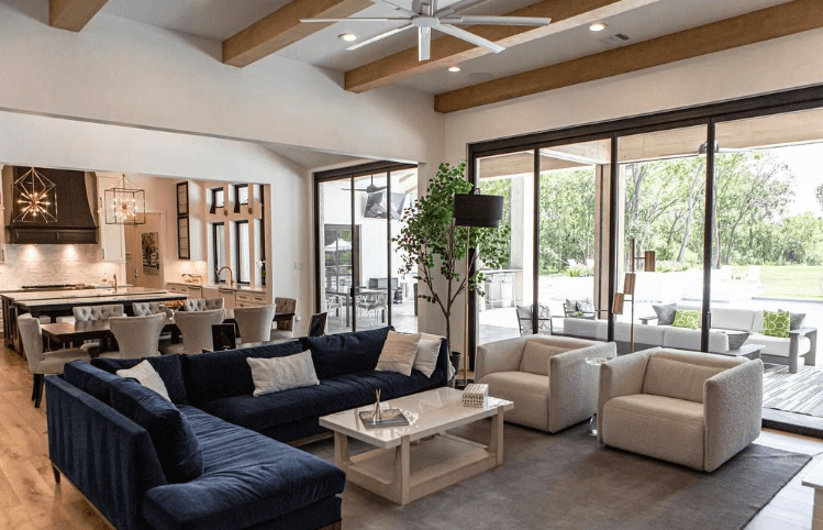
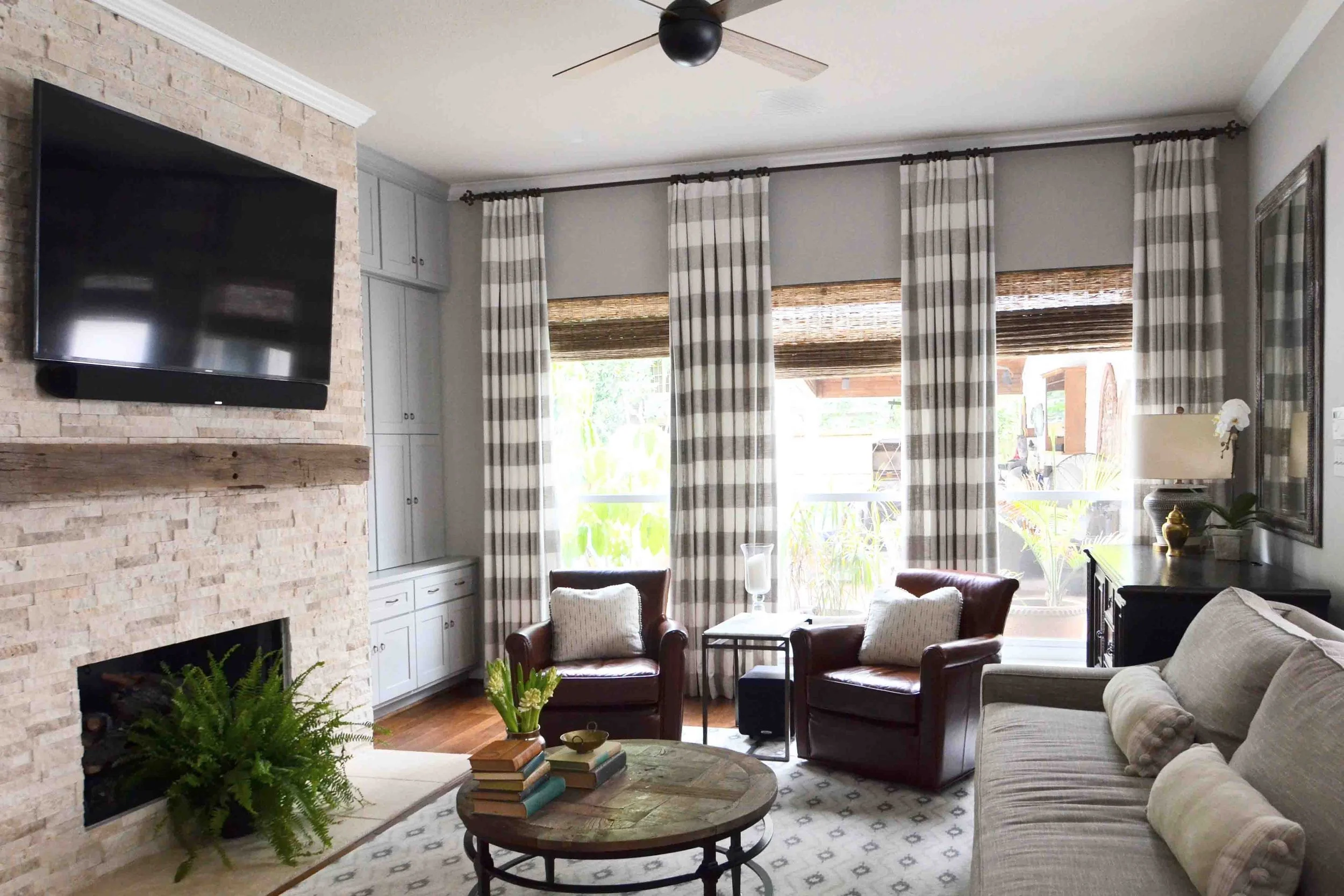
Living Rooms: Where Colorado Views Meet Interior Color
Living rooms in South Denver homes often feature large windows showcasing mountain views, open spaces, or mature trees. Your paint color needs to complement both interior furnishings and exterior views.
For south-facing living rooms with intense light:
Cooler neutrals balance warm afternoon light
Benjamin Moore's "Revere Pewter" or "Classic Gray"
Sherwin-Williams' "Repose Gray" or "Agreeable Gray"
Avoid warm beiges that can feel overwhelming
For north-facing living rooms with cool light:
Warm neutrals add necessary warmth
Benjamin Moore's "Edgecomb Gray" or "Manchester Tan"
Sherwin-Williams' "Accessible Beige" or "Kilim Beige"
Avoid cool grays that will feel cold
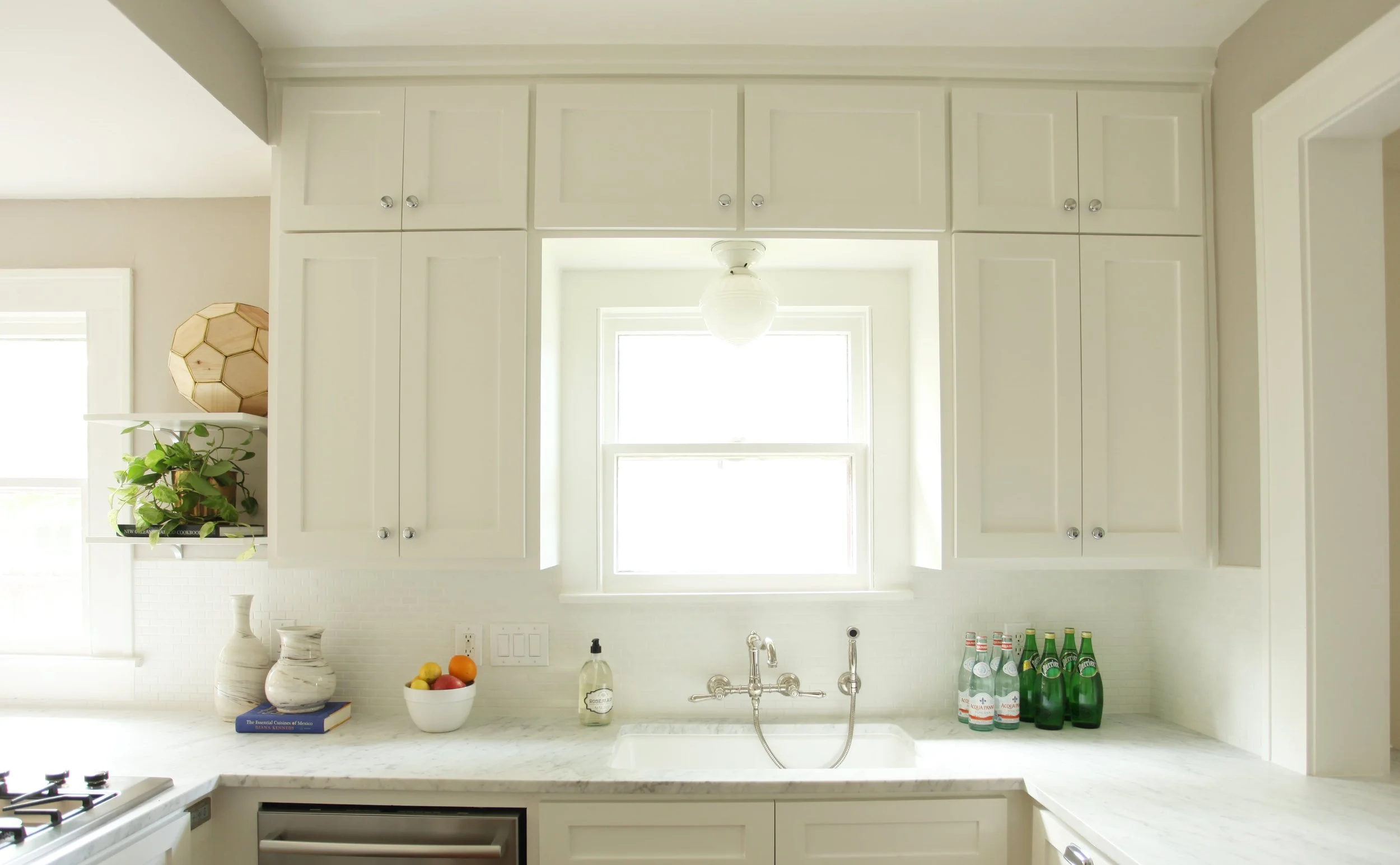
Kitchens: Balancing Natural and Task Lighting
Kitchens require careful color selection because they combine natural light, task lighting, and various material reflections (cabinets, countertops, backsplash).
For kitchens with white or light cabinets:
Warm neutrals prevent sterile feeling
Consider how color looks with your countertop material
Test next to backsplash tile
Sherwin-Williams' "Alabaster" or Benjamin Moore's "White Dove" for trim and cabinets
Slightly deeper neutral for walls
For kitchens with dark or wood cabinets:
Lighter walls balance darker elements
Warm whites work well
Avoid cool tones that create stark contrast
Benjamin Moore's "Simply White" or "Chantilly Lace"
Open-concept considerations: Living areas that flow into kitchens need color consistency. Choose neutrals that work in both spaces under different light conditions.
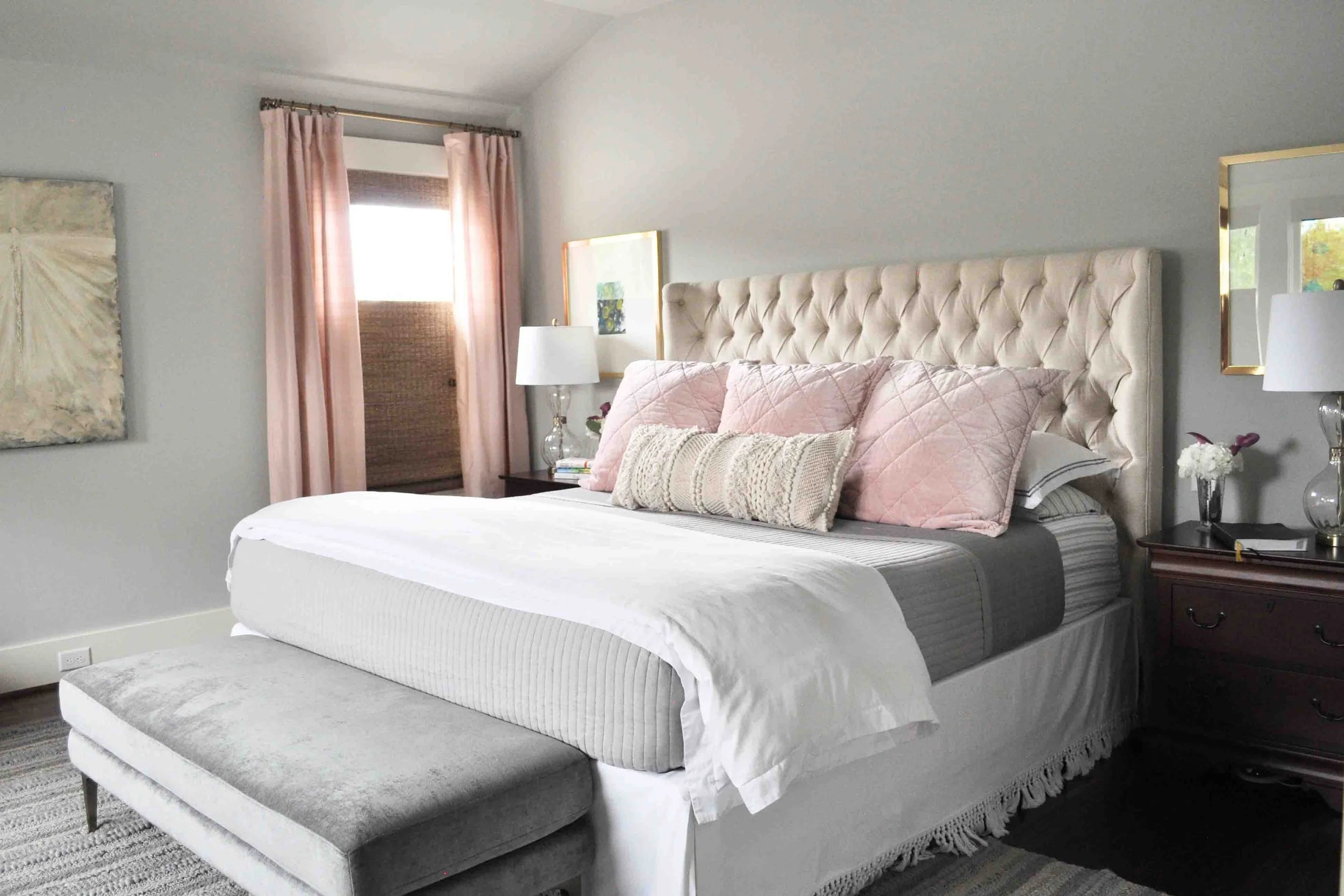
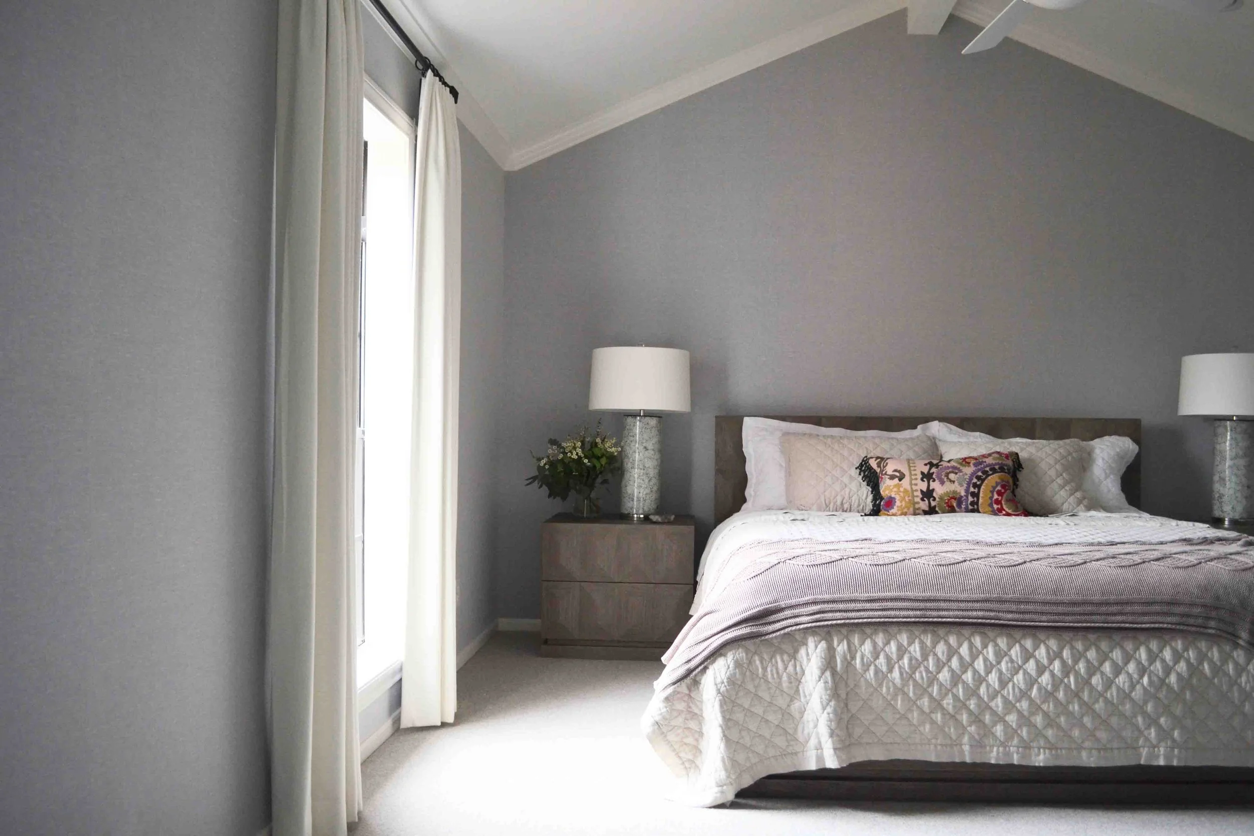
Bedrooms: Creating Restful Spaces Despite Colorado's Brightness
Bedrooms need color that feels restful in bright morning light and cozy under evening lighting.
East-facing bedrooms (morning sun):
Cool colors feel fresh but not jarring
Soft blues, greens, or cool grays
Benjamin Moore's "Palladian Blue" or "Quiet Moments"
Window treatments crucial for light control
West-facing bedrooms (afternoon/evening sun):
Warm colors glow beautifully in afternoon light
Soft greens, warm grays, muted earth tones
Sherwin-Williams' "Sea Salt" or "Comfort Gray"
Consider how color looks in morning (when you're getting dressed)
Primary bedrooms (often multiple exposures):
Neutral enough to work in all light conditions
Warm greiges or soft whites
Test in both morning and evening light
Benjamin Moore's "Balboa Mist" or Sherwin-Williams' "Worldly Gray"
Bathrooms: Small Spaces, Big Light Impact
Bathrooms often have smaller windows but artificial lighting significantly impacts how paint appears.
For bathrooms with natural light:
Cool whites feel spa-like
Benjamin Moore's "Decorator's White" or "Cloud White"
Test with your tile and vanity color
Consider mirror reflection effects
For bathrooms without windows:
Warmer whites prevent cave-like feel
Benjamin Moore's "White Dove" or Sherwin-Williams' "Alabaster"
Install quality lighting before choosing color
Test under your actual light bulbs, not just daylight
Historic Homes: Respecting Architecture While Working with Colorado Light
Historic Littleton homes with original wood trim, smaller windows, and period architecture require different color approaches than newer Centennial or Castle Pines homes.
For homes with dark wood trim:
Warm neutrals complement wood tones
Benjamin Moore's "Edgecomb Gray" or "Manchester Tan"
Avoid cool grays that create harsh contrast
Honor architectural details with appropriate colors
For homes with white or painted trim:
More flexibility with wall colors
Consider period-appropriate palettes
Test how colors look with original floor materials
Sherwin-Williams' Historic Color Collection offers authentic options
The Colorado Paint Color Palette: What Actually Works
After designing dozens of South Denver homes, these colors consistently perform well in Colorado's light:
Foolproof Neutrals for South-Facing Rooms
Benjamin Moore:
"Revere Pewter" (warm gray, slight beige undertone)
"Classic Gray" (true gray, minimal undertones)
"Gray Owl" (soft gray-green, works with Colorado landscapes)
Sherwin-Williams:
"Repose Gray" (soft gray, slight warm undertone)
"Agreeable Gray" (greige that stays neutral)
"Colonnade Gray" (medium gray, handles intense light well)
Warm Neutrals for North-Facing Rooms
Benjamin Moore:
"Edgecomb Gray" (warm greige, beige undertones)
"Manchester Tan" (soft tan, works with wood tones)
"Balboa Mist" (warm gray-green, versatile)
Sherwin-Williams:
"Accessible Beige" (true warm neutral)
"Kilim Beige" (warm without yellow)
"Comfort Gray" (warm greige)
Whites That Work in Colorado
Benjamin Moore:
"White Dove" (soft white, slight warmth)
"Decorator's White" (clean white, not stark)
"Simply White" (warm white for trim)
Sherwin-Williams:
"Alabaster" (warm white, very popular)
"Pure White" (clean without being icy)
"Extra White" (bright but not harsh)
Beyond Neutrals: Adding Color in Colorado Light
Colorado's intense light makes saturated colors appear even more vibrant. If you're adding color beyond neutrals:
Blues that work:
Muted, dusty blues rather than bright
Blues with gray undertones
Benjamin Moore's "Constellation" or Sherwin-Williams' "Distance"
Greens that work:
Sage and muted greens complement Colorado landscapes
Avoid bright greens that will intensify
Benjamin Moore's "Saybrook Sage" or Sherwin-Williams' "Clary Sage"
Warm colors (use carefully):
Muted terracotta or rust in north-facing rooms
Avoid bright yellows, oranges, reds in south-facing rooms
Test extensively—warm colors intensify dramatically
The Testing Process: Don't Skip This Step
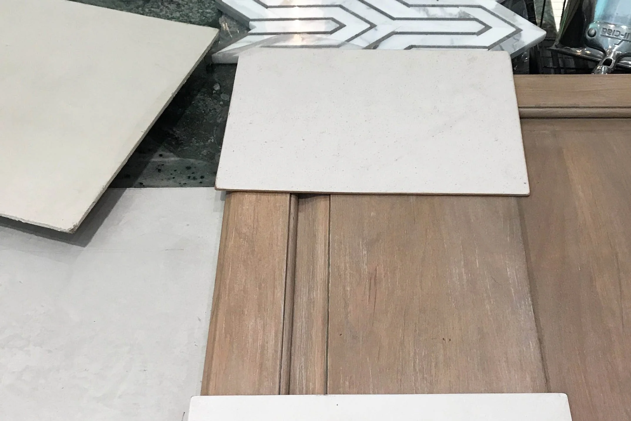
Paint samples on small boards or single walls don't provide accurate information. Here's the proper testing process for Colorado homes:
Step 1: Large Samples
Paint 2' x 2' samples directly on the wall (or larger poster boards hung on the wall). You need to see enough color to evaluate it properly.
Step 2: Multiple Walls
Paint samples on at least two walls—one that gets direct light and one that doesn't. Colors look completely different on different walls in the same room.
Step 3: Time of Day Testing
Observe your samples at:
Morning (8-10 AM)
Midday (12-2 PM)
Afternoon (4-6 PM)
Evening with artificial lighting
Take photos at each time—they'll help you compare objectively.
Step 4: Context Testing
Look at your samples:
Next to your flooring
Next to fixed elements (cabinets, countertops, tile)
With your furniture in the room
From doorways and adjacent rooms
Step 5: Live With It
Keep samples up for at least a week. You'll notice things on day 5 that you didn't see on day 1. Weather changes, seasonal light shifts, and your own perception evolving all provide valuable information.
Common Colorado Paint Color Mistakes
Mistake 1: Choosing Color From Online Photos
Colors on screens don't represent how they'll look in your home's specific light. Always test physical samples.
Mistake 2: Testing Too Small
Those little paint chips from the store are useless for making final decisions. You need large samples on your actual walls.
Mistake 3: Ignoring Existing Elements
Your paint color must work with your flooring, countertops, cabinets, and furniture. Test samples in context, not isolation.
Mistake 4: Assuming White Is Easy
White is one of the hardest colors to get right in Colorado. The wrong white will look stark, icy, dingy, or yellow. Test multiple whites extensively.
Mistake 5: Painting Everything the Same Color
Open-concept homes still benefit from slight color variation between spaces. Rooms with different light exposure need different (though coordinated) colors.
Mistake 6: Not Considering Artificial Lighting
Colorado's natural light is intense, but you also use rooms in the evening. Test your colors under your actual light bulbs (warm LED, cool LED, etc.).
Working With Contractors and Painters
Once you've chosen your colors, proper execution matters.
Primer Matters in Colorado
Colorado's dry climate and temperature swings require quality primer:
Use tinted primer close to your final color
Don't skip primer on new drywall
Use stain-blocking primer on wood or previously painted surfaces
Consider Colorado's low humidity when timing between coats
Paint Quality Makes a Difference
High-quality paint performs better in Colorado's harsh UV exposure:
Better color retention (less fading)
More durable finish
Easier to touch up
Worthwhile investment for long-term results
Recommended paint lines:
Benjamin Moore Aura or Regal Select
Sherwin-Williams Duration or Emerald
Avoid contractor-grade paints for interior walls
Sheen Selection
Different sheens serve different functions and look different in Colorado's light:
Flat/Matte:
Hides imperfections
No sheen to reflect light
Harder to clean
Best for low-traffic areas, ceilings
Eggshell:
Slight sheen
More durable than flat
Easier to clean
Good for living rooms, bedrooms, dining rooms
Satin:
Noticeable sheen
Very durable
Easy to clean
Good for kitchens, bathrooms, kids' rooms, trim
Semi-gloss:
Shiny finish
Most durable
Easiest to clean
Best for trim, doors, cabinets
In Colorado's intense light, higher sheens reflect more light and show imperfections more readily. Most walls work best with eggshell or satin.
Adjusting for Open-Concept Homes
Many Centennial, Castle Pines, and Highlands Ranch homes feature open-concept layouts where multiple spaces flow together. This presents unique color challenges.
Creating Visual Separation Without Walls
Use paint color to define spaces while maintaining flow:
Strategy 1: Same color, different accent walls
Main living areas in one neutral
Accent walls in slightly deeper or different tone
Creates definition without harsh transitions
Strategy 2: Coordinated color palette
Adjacent spaces in colors from same family
Slightly different tones that work together
Test where colors meet to ensure smooth transition
Strategy 3: Consistent neutrals with different ceilings
Walls in same neutral throughout
Ceiling color variation defines spaces
Sophisticated approach for homes with architectural detail
Handling Different Light in Connected Spaces
When your kitchen flows into living areas, one space may be north-facing while another is south-facing. The same color won't work in both.
Solution: Use two coordinated colors:
Cooler neutral in south-facing space
Warmer neutral in north-facing space
Test where they meet to ensure they work together
Paint Color and Resale Value
If you're planning to sell your Centennial or Highlands Ranch home within a few years, paint color impacts buyer perception.
Colors that appeal to most buyers:
Warm, light neutrals throughout
Consistent color scheme (not every room different)
Fresh, well-maintained paint
Benjamin Moore's "Edgecomb Gray" or Sherwin-Williams' "Accessible Beige" are safe choices
Colors that limit buyer appeal:
Dark accent walls (perceived as too bold)
Trendy colors that date quickly
Different bright color in every room
Very cool grays (can feel cold and unwelcoming)
When to Hire a Professional
Choosing paint colors is one of the most challenging design decisions because the stakes feel low (it's just paint!) but the impact is high (wrong color affects every day you live there).
Consider professional help if:
You've tested multiple colors and can't decide
You're working with challenging light conditions
You have open-concept spaces with different exposures
You're coordinating with existing elements (cabinets, tile, flooring)
You want colors that flow throughout your entire home
You've made color mistakes before and want to get it right
A design consultation can provide expert guidance on color selection, testing process, and coordination with your existing elements. The investment often saves money and frustration compared to repainting wrong choices.
Need help choosing paint colors for your Colorado home?
I offer design consultations specifically for clients who need expert color guidance. We'll evaluate your home's light, test colors properly, and ensure you choose colors that work beautifully in your specific space.
Jamie House Design
Serving Centennial, Castle Pines, Highlands Ranch, Littleton
(720) 432-2029
Schedule a Color Consultation | View Portfolio | Learn About Services
About the Author
After designing homes across three continents and working in diverse light conditions from Berlin to Shanghai, Jamie House brings international perspective to Colorado's unique light challenges. Based in Centennial and focusing exclusively on South Denver suburbs, she understands how Colorado's high-altitude, intense natural light affects paint colors differently than anywhere else. Her architectural training from Texas Tech University and years of hands-on project experience inform her practical approach to color selection that balances beauty with how homes are actually lived in.